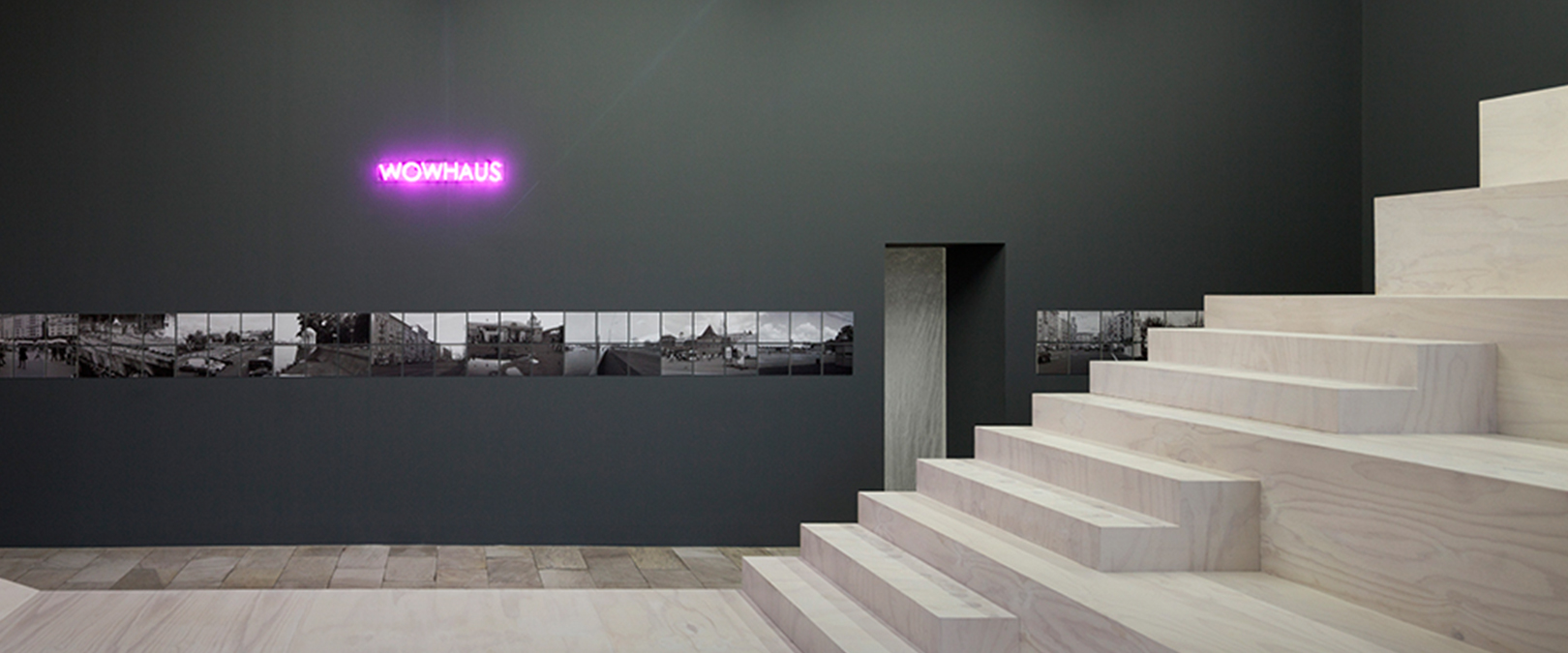
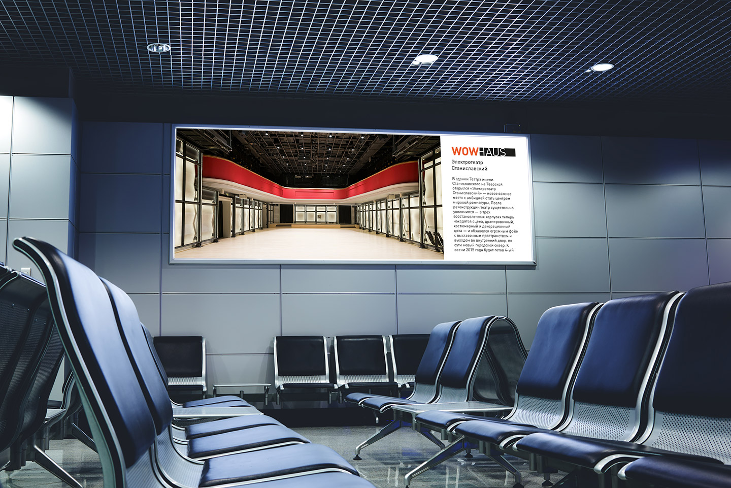
Wowhaus architecture bureau
Logo and corporate identity development
Objectives: to update the outdated logo, which was previously used in a chaotic manner, and to work on the already formed corporate identity of the company.
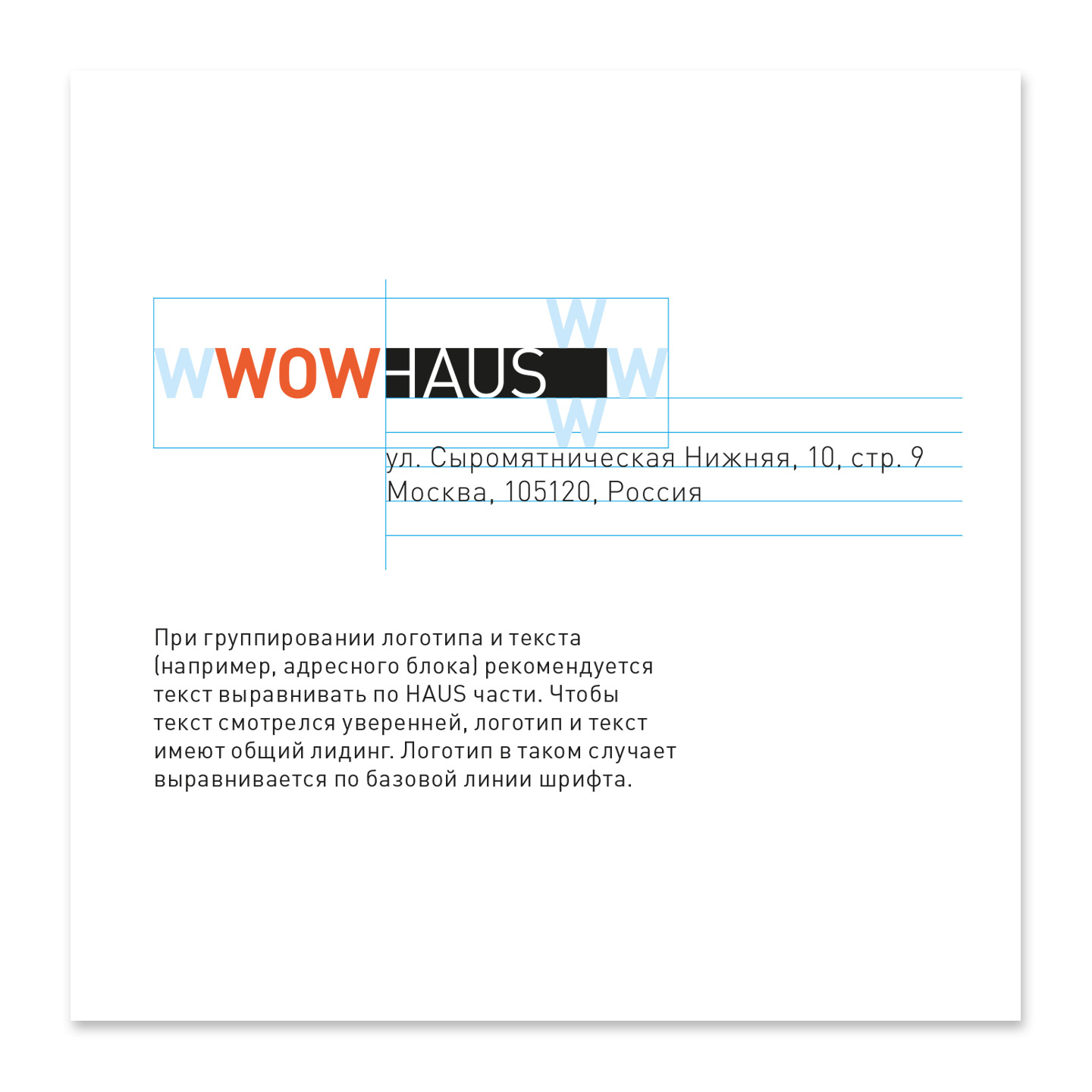
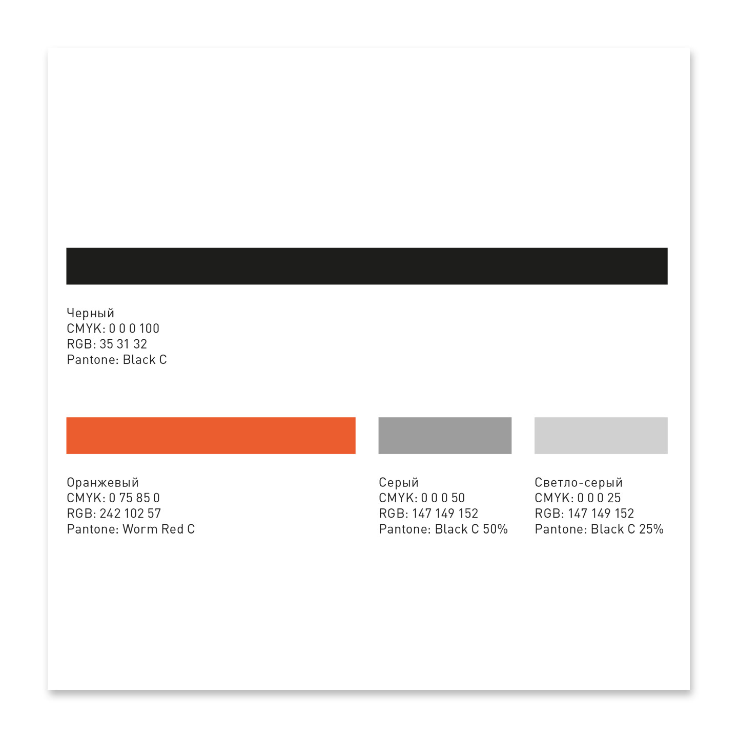
Result: we brought the logo to a more modern state, made it neater, more contrasting, and got a clear, strict, developed structure to be used for business documentation (letterheads, business cards, stickers) and other POS materials. We prescribed all style-forming constants - we developed and defined the basic constants that formed a complete corporate style of the company. At the same time, we managed to retain a recognisable style for existing clients, for example, the corporate pattern, which is made up of the letters WH and visually resembles architectural elements, such as windows of a multi-storey building, street paving, stairs, etc.